
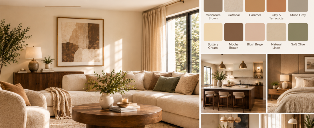
Warm neutral colors have a special way of making a home feel inviting without making it look overly decorated. Think creamy whites, soft beige, sandy taupe, warm greige, caramel, and earthy browns. These shades create a relaxed backdrop that feels comfortable in every season, whether you’re decorating a small apartment, refreshing a living room, or planning a complete home makeover.
The beauty of warm neutral color ideas is their versatility. You can pair them with natural wood, linen, woven textures, stone, and muted greens to create a space that feels both sophisticated and lived-in. And unlike some trendy colors that can quickly feel dated, warm neutrals offer a timeless foundation that is easy to update with accessories.
In this article, we’ll explore 15 warm neutral color ideas, how to use them in different rooms, which shades work together, and simple decorating tricks to make your home feel warm, balanced, and beautifully put together.
15 Warm Neutral Color Ideas
1. Creamy White
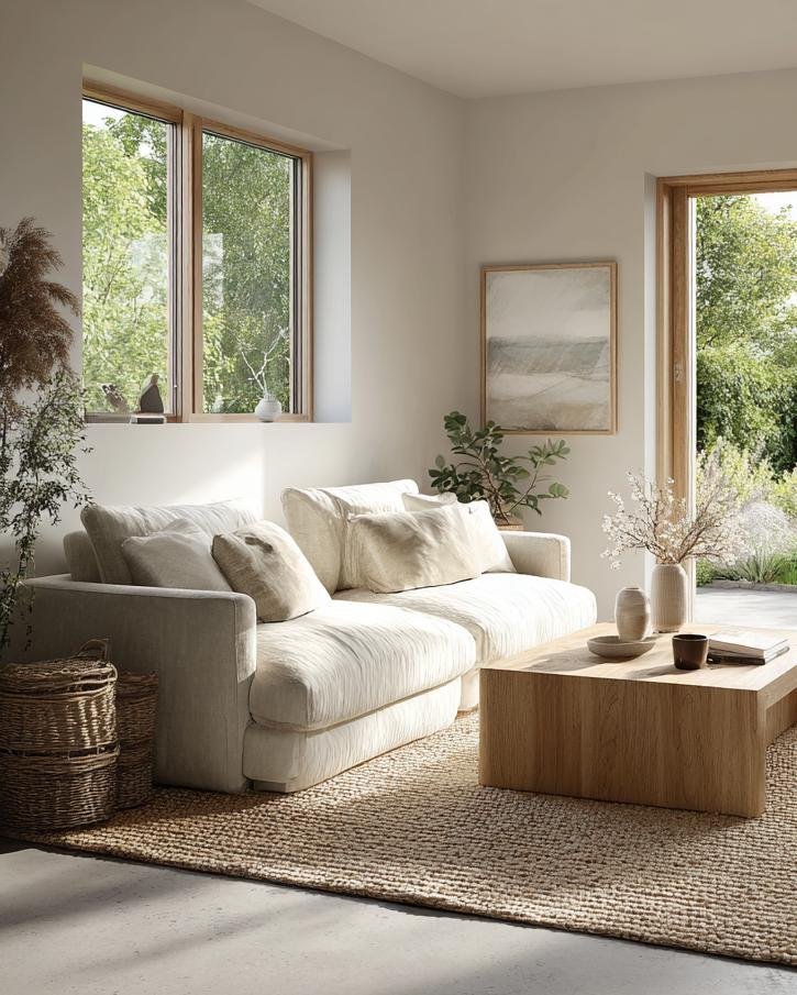
Creamy white is one of the most versatile warm neutral colors for creating a bright, comfortable home. Unlike stark white, which can sometimes feel clinical or overly sharp, creamy white has a gentle yellow or beige undertone that makes a room feel softer. It reflects natural light beautifully while maintaining a sense of warmth, making it especially useful in living rooms, bedrooms, entryways, and open-plan spaces.
If you love the clean appearance of white walls but want your home to feel more welcoming, creamy white is an excellent starting point. Pair it with natural oak furniture, linen curtains, warm ivory upholstery, and woven baskets. The combination creates a relaxed interior that feels polished without appearing overly formal. A creamy white backdrop also allows artwork, houseplants, and decorative accessories to stand out naturally.
In a living room, consider using creamy white on the walls and introducing contrast through a slightly deeper beige sofa or a natural wood coffee table. This creates a layered appearance without relying on strong colors. In a bedroom, creamy white bedding combined with oatmeal pillows and a textured ivory throw can make the space feel like a peaceful retreat.
Lighting matters when selecting creamy white paint. In a room with abundant sunlight, the color may appear brighter and more neutral, while artificial lighting can emphasize its warmer undertones. Always test paint samples on different walls before committing to a whole room.
Decorating tip: Combine creamy white with at least two different textures, such as linen, boucle, or unfinished wood. This keeps an all-white neutral space from looking flat.
2. Warm Beige
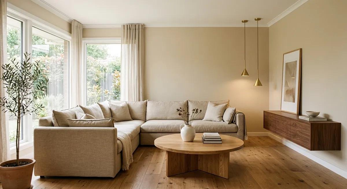
Warm beige is a classic choice for anyone who wants a home that feels welcoming, grounded, and easy to decorate. It sits between cream and brown, offering enough color to create definition while remaining subtle enough to work with many furniture styles. Beige has been used in interiors for decades, but modern versions often feature softer, more natural undertones that feel fresh rather than dated.
The great thing about warm beige is how effortlessly it adapts to different rooms. In a living room, beige walls can create a comfortable backdrop for a cream sofa, wooden coffee table, and textured rug. In a bedroom, beige bedding and upholstered furniture can make the space feel calm and restful. Even in a hallway, beige can soften the transition between brighter rooms and darker areas of the home.
To keep beige from feeling monotonous, avoid using precisely the same shade on every surface. Instead, layer light beige walls with deeper tan cushions, warm white curtains, and furniture in walnut or oak. A few black accents, such as a slim lamp or picture frame, can add definition without disrupting the warmth of the palette.
Beige also works beautifully with natural materials. Jute rugs, rattan baskets, linen upholstery, and stone accessories introduce subtle variations that make the space feel collected and authentic. You don’t need a lot of decorative objects when the materials themselves provide visual interest.
Decorating tip: For a cohesive look, choose one dominant beige shade, one lighter neutral, and one darker wood tone. This simple combination works especially well in open-plan homes.
3. Soft Greige
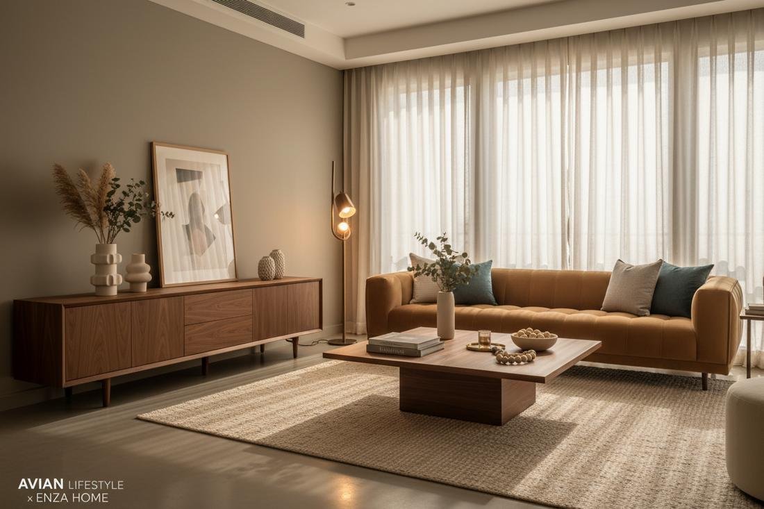
Soft greige combines gray and beige, creating a balanced neutral that feels contemporary without becoming cold. It is especially appealing if you like the understated look of gray but want to avoid the chilly atmosphere that some cool gray shades can create. A warm greige with beige or taupe undertones can bring a sophisticated softness to modern interiors.
This color is particularly useful in spaces where you want a neutral backdrop with a little more depth than white. Greige walls can make a living room feel refined, especially when paired with cream upholstery, natural wood, and soft ambient lighting. In a home office, greige can create a calm visual environment without feeling as stark as white or as dark as charcoal.
One of the most attractive ways to use greige is through tonal layering. Imagine greige walls, a pale gray-beige sofa, a warm ivory rug, and a walnut side table. Each element belongs to the same color family, yet the differences in depth and texture prevent the room from feeling repetitive. You can also introduce muted green plants or subtle brass accessories to add another dimension.
Greige is a color that changes noticeably depending on lighting. Some shades look more gray in north-facing rooms, while others appear almost beige in warm afternoon sunlight. Before selecting a paint color, observe the sample throughout the day and compare it with your flooring and furniture.
Decorating tip: Choose a greige with a visible warm undertone if your room already contains warm wood floors, tan leather, or beige furnishings.
4. Sandy Taupe
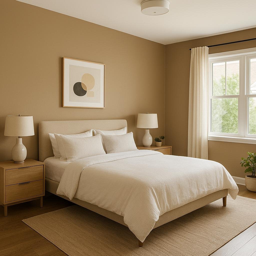
Sandy taupe is a beautiful combination of beige, brown, and subtle gray that brings a grounded, natural feeling to interiors. It is deeper than many traditional beige shades but lighter and softer than dark brown, making it a useful middle tone for a layered neutral palette. The color often resembles natural sand, weathered stone, or sun-warmed earth.
For bedrooms, sandy taupe can create a restful atmosphere without making the space feel too dark. Use it on the walls behind an upholstered bed, then layer ivory bedding, soft beige cushions, and a textured wool throw. A warm wooden bedside table and a ceramic lamp can complete the look with a relaxed, understated character.
In a living room, sandy taupe works particularly well with cream sofas and darker wood furniture. The contrast is gentle rather than dramatic, which makes the room feel balanced and comfortable. It also complements natural materials such as travertine, linen, leather, and woven fibers.
If you want to introduce taupe without repainting, start with curtains, rugs, upholstered chairs, or decorative cushions. These smaller elements can help establish a warm palette while allowing existing white walls to remain in place. A taupe area rug, for example, can visually connect a cream sofa with wooden flooring and darker accessories.
Decorating tip: Pair sandy taupe with creamy white and medium-toned wood. This combination creates a natural, harmonious palette that works in both traditional and modern homes.
5. Warm Ivory
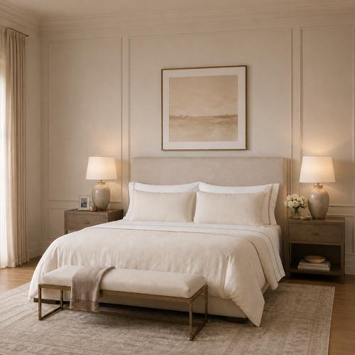
Warm ivory offers the brightness of white with a softer, slightly creamy appearance. It is an excellent choice for interiors that need lightness but would benefit from a little more warmth and depth. While creamy white and ivory are closely related, ivory often has a richer, more noticeable creamy or pale yellow quality.
This shade is especially attractive in bedrooms and living rooms where comfort is just as important as visual simplicity. Ivory bedding can make a bed look inviting without requiring a complicated arrangement of colors. Combine it with linen sheets, a textured quilt, and a slightly darker beige blanket for a layered appearance that feels thoughtful and relaxed.
In living spaces, ivory can be used on walls, upholstery, curtains, or even large area rugs. An ivory sofa, for example, pairs beautifully with a walnut coffee table, tan leather accessories, and muted brown cushions. The light upholstery keeps the room feeling open, while the darker elements add visual structure.
Warm ivory is also useful for balancing deeper neutral colors. If you love chocolate brown, caramel, or mushroom shades but worry that they might overwhelm your room, ivory provides a bright counterpoint. It softens the contrast and allows richer colors to become accents rather than dominate the entire space.
Decorating tip: Mix ivory with natural linen and pale wood for a soft, airy look. For a more sophisticated style, add antique brass, darker walnut, or a few deep brown accessories.
6. Mushroom Brown
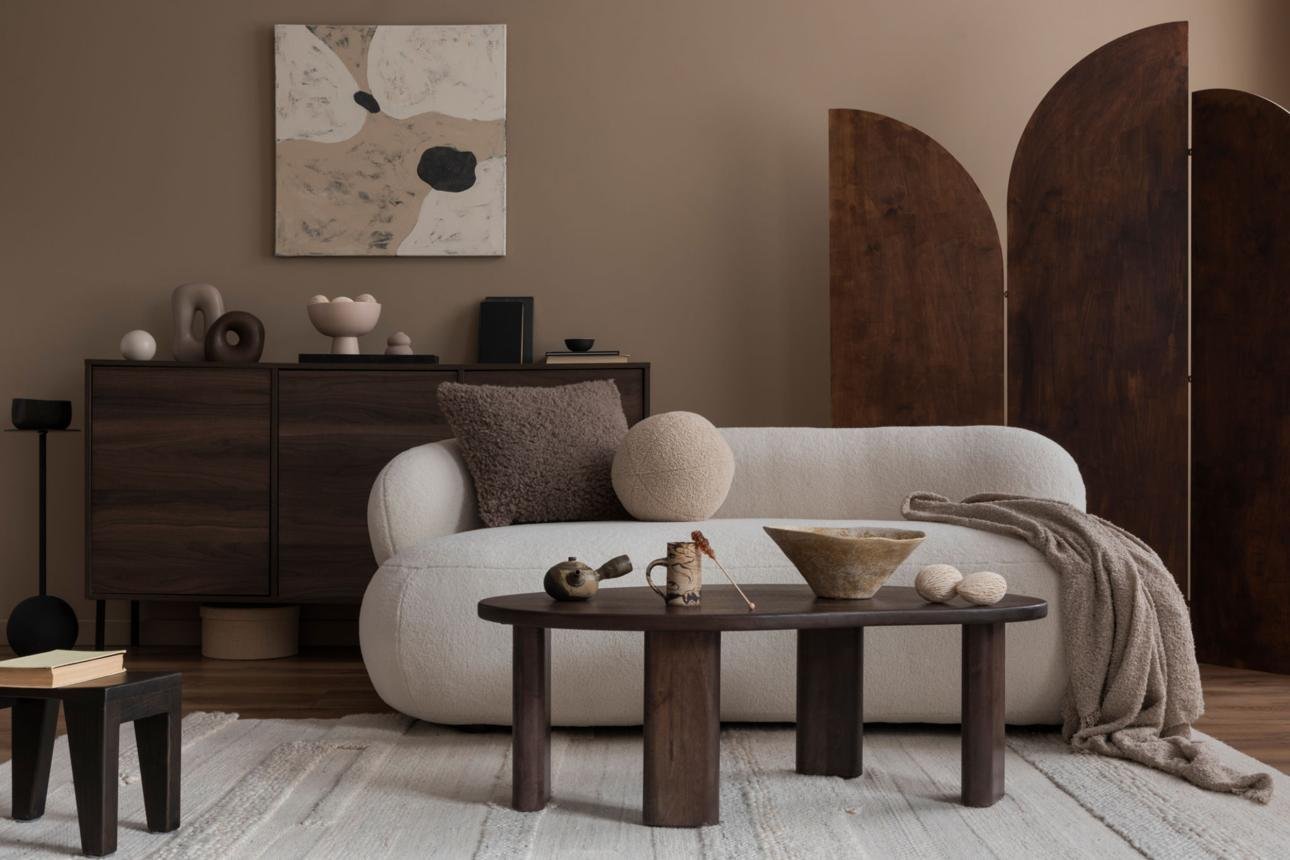
Mushroom brown is an earthy neutral that blends gray, brown, and taupe into a muted, sophisticated shade. It has more depth than beige but often feels softer than a traditional chocolate brown. The result is a color that looks natural, slightly moody, and wonderfully suited to cozy interiors.
If you want to create a living room that feels intimate and refined, mushroom brown is worth considering. Use it on an accent wall, in an upholstered armchair, or through a large area rug. Pair it with warm ivory, cream, and medium-toned wood to keep the overall palette balanced. The combination creates a subtle contrast that feels rich without being overwhelming.
Mushroom brown also works well in dining rooms, where deeper neutral shades can make the space feel more defined. A mushroom-colored wall behind a wooden dining table, paired with cream upholstery and warm pendant lighting, can create an inviting setting for everyday meals and gatherings.
For a smaller room, you don’t have to avoid mushroom brown entirely. Instead, use it in smaller doses or select a lighter version with a noticeable beige undertone. Curtains, cushions, and decorative ceramics are easy ways to introduce the shade without making the room feel visually heavy.
Decorating tip: Combine mushroom brown with ivory, caramel, and natural wood. The different undertones add richness while keeping the palette connected to nature.
7. Oatmeal
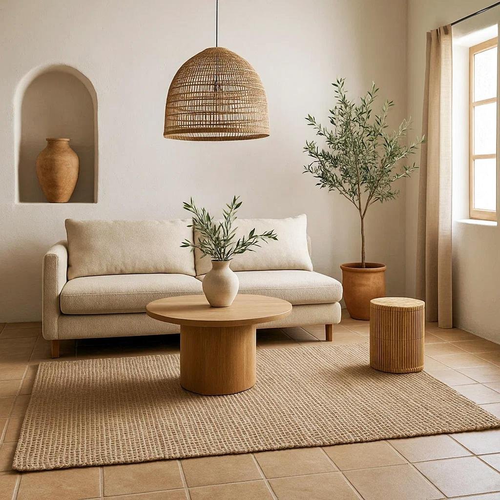
Oatmeal is a soft, slightly textured-looking neutral inspired by the natural color of oats and undyed fabrics. It usually sits between cream and beige, with subtle hints of tan or gray. The color feels casual and comfortable, making it particularly well suited to relaxed homes where natural materials play an important role.
One of the easiest ways to use oatmeal is through upholstery and textiles. An oatmeal-colored sofa can serve as the foundation for a living room filled with natural textures. Add a cream throw, beige cushions, a jute rug, and an oak coffee table. The result feels coordinated without requiring every item to match exactly.
Oatmeal also works beautifully in bedrooms. Bedding in oatmeal linen or cotton creates a softer alternative to bright white while still keeping the room light. Layer it with ivory pillowcases and a warm taupe blanket to introduce gentle variation. If you prefer a minimalist bedroom, these subtle differences in fabric and color can provide enough visual interest without clutter.
For walls, oatmeal can be an excellent alternative to conventional beige. It feels slightly more relaxed and can complement both rustic and contemporary furniture. In rooms with limited natural light, choose a lighter oatmeal shade and combine it with warm lamps to prevent the space from appearing dull.
Decorating tip: Use oatmeal as a bridge between lighter ivory and darker brown. It helps connect the different shades and creates a smooth, natural transition throughout a room.
8. Caramel
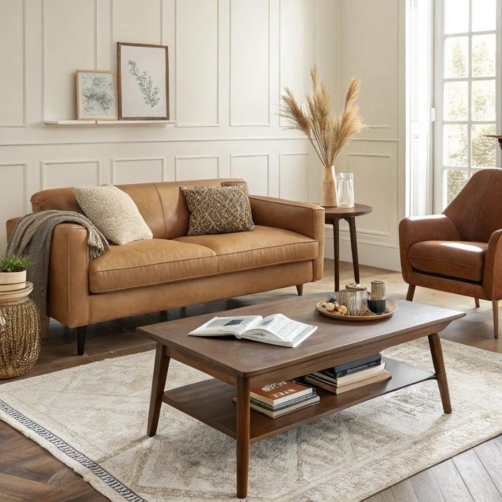
Caramel brings a rich, golden-brown warmth to neutral interiors. It is deeper than beige and more golden than many traditional browns, making it an ideal accent when a room needs warmth and character. Caramel can feel luxurious without being flashy, especially when used with natural materials and simple silhouettes.
A caramel leather sofa is a classic way to introduce this color into a living room. It pairs beautifully with cream walls, an ivory rug, and walnut or oak furniture. The warm leather adds contrast while maintaining a natural appearance. If a full sofa feels like too much, try caramel cushions, a leather ottoman, or a small accent chair instead.
Caramel also works well in kitchens and dining areas. Wooden stools, leather dining chairs, or caramel-colored ceramics can bring warmth to a kitchen with cream cabinetry. Combined with stone countertops and warm metal hardware, the color creates an inviting environment that feels both practical and stylish.
The key to decorating with caramel is balance. Because it has a stronger presence than ivory or oatmeal, use it alongside lighter shades to keep the room from becoming too dark. Cream, warm white, and pale beige allow caramel to stand out without competing with other elements.
Decorating tip: Pair caramel with creamy white, walnut, and muted olive for an earthy, sophisticated palette that works especially well in living rooms and dining spaces.
9. Clay and Terracotta
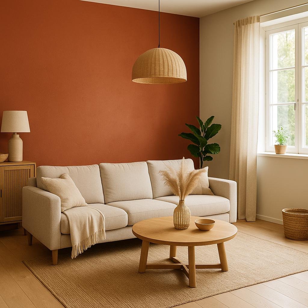
Clay and terracotta introduce an earthy warmth that sits between neutral and muted color. Although terracotta often has a noticeable reddish or orange undertone, softer clay shades can work much like warm neutrals. They bring the natural character of sunbaked earth into a room without requiring bright or highly saturated colors.
If you want to make a neutral room feel more distinctive, consider a muted clay accent wall. In a living room, it can create a beautiful backdrop for a cream sofa, wooden furniture, and woven accessories. In a bedroom, a soft terracotta shade behind the bed can add warmth and depth while remaining comfortable enough for a restful setting.
You can also incorporate clay through decorative objects rather than paint. Terracotta planters, handmade ceramic vases, textured bowls, and clay-colored cushions are simple ways to introduce the shade. These accessories work particularly well in organic modern, Mediterranean, rustic, and bohemian interiors.
The best way to keep clay and terracotta feeling balanced is to surround them with lighter neutrals. Ivory, oatmeal, warm beige, and natural linen soften the reddish undertones. A few green plants can provide a fresh contrast, while wood and stone reinforce the natural character of the palette.
Decorating tip: Choose muted, dusty terracotta rather than a highly saturated orange if you want the color to blend seamlessly into a warm neutral decorating scheme.
10. Warm Stone Gray
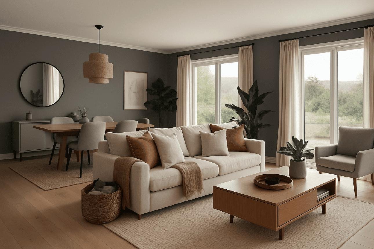
Warm stone gray is a muted gray with beige, brown, or subtle taupe undertones. It provides a slightly more structured appearance than cream or beige while avoiding the coolness associated with blue-based grays. The shade is inspired by natural limestone, weathered stone, and soft mineral surfaces.
This color is useful when you want a neutral room to feel contemporary and understated. Warm stone gray walls can create a beautiful background for cream upholstery, natural oak furniture, and simple black accents. The gray undertone gives the space definition, while the warmer elements keep it from feeling cold.
In kitchens, warm stone gray can be used on cabinetry, a backsplash, or even an island. It works particularly well with cream cabinets, brushed brass hardware, and natural wood shelves. The combination feels subtle and timeless without relying on stark black-and-white contrast.
Warm stone gray can also be introduced through flooring, rugs, and accessories. A stone-gray rug with beige undertones can connect a cream sofa with darker furniture, while gray-beige cushions can soften the appearance of a room with predominantly wooden furnishings.
Decorating tip: Check warm gray samples against your flooring and furniture before painting. A gray that looks warm on its own may appear cooler beside strongly yellow or orange wood.
11. Buttery Cream
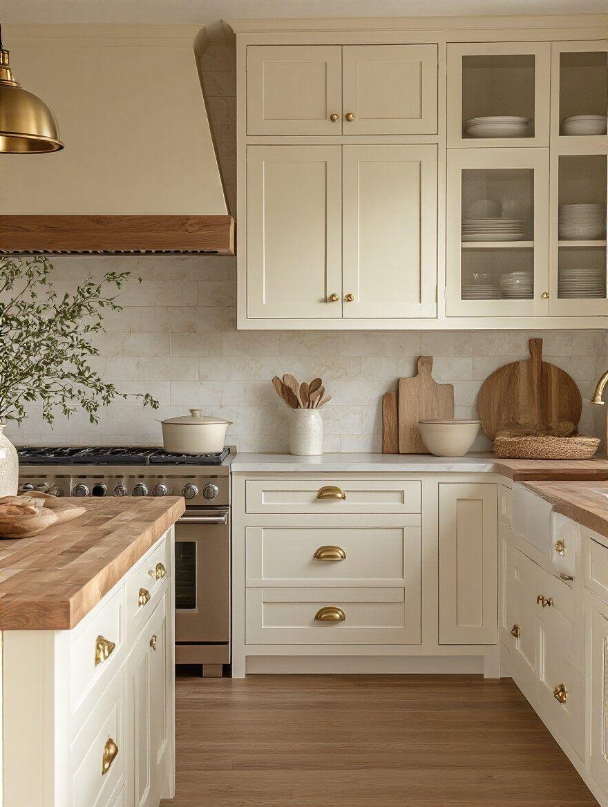
Buttery cream is a gentle yellow-based neutral that brings a sunny, welcoming quality to interiors. It is warmer than ivory and often has a subtle golden appearance, making it particularly appealing in kitchens, breakfast nooks, and rooms where you want a cheerful atmosphere.
The shade works beautifully on kitchen cabinetry. Buttery cream cabinets paired with warm wood countertops, brass hardware, and a pale stone backsplash can create a timeless kitchen that feels welcoming rather than overly formal. If you prefer a more modern look, keep the cabinet profiles simple and use clean-lined lighting to balance the softness of the color.
In living rooms, buttery cream can be introduced through cushions, lampshades, curtains, and upholstered furniture. It pairs naturally with beige, caramel, and light brown, creating a palette that feels sunny without becoming too colorful. A buttery cream throw on a beige sofa, for example, can make the entire arrangement feel warmer and more inviting.
Because yellow undertones can become more pronounced under certain lighting, it is important to test buttery cream before using it on large surfaces. In rooms with strong afternoon sunlight, some shades may look considerably more golden than expected.
Decorating tip: Combine buttery cream with warm white and natural oak for a soft, welcoming look. Add small touches of muted green or terracotta if you want a little more contrast.
12. Mocha Brown
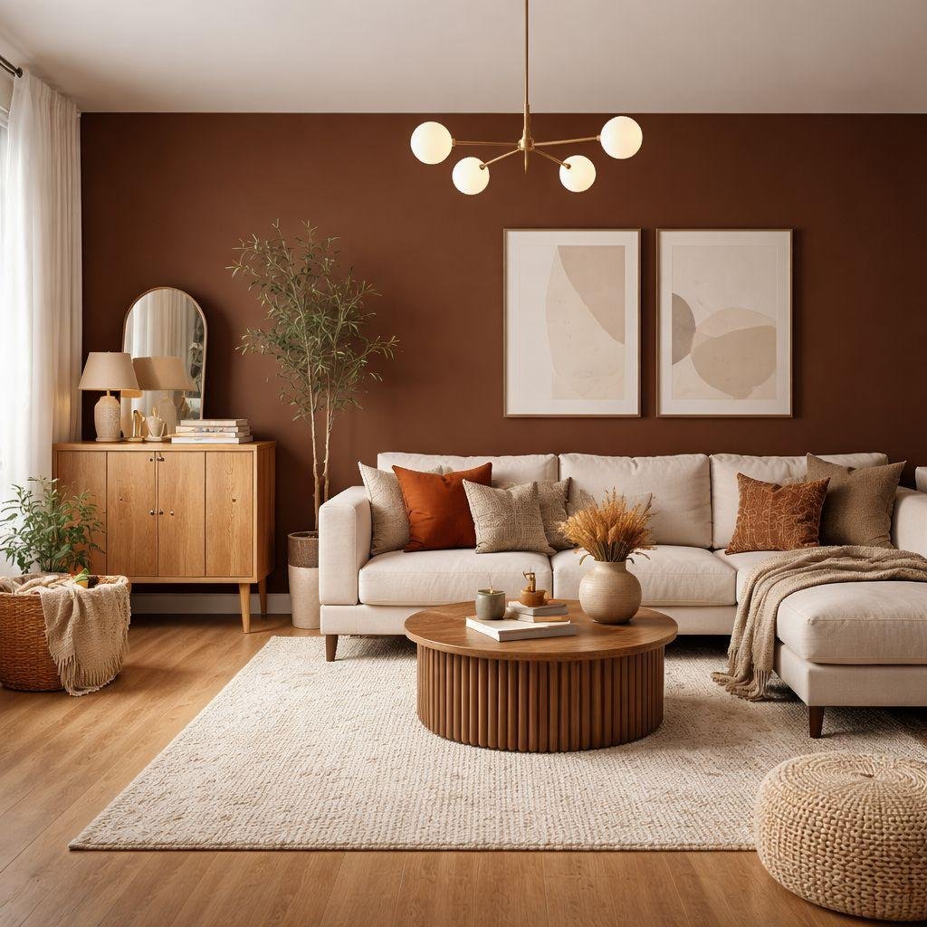
Mocha brown is a rich, coffee-inspired neutral that adds depth and sophistication to a warm color palette. It is darker than caramel and often has subtle gray or reddish undertones, depending on the particular shade. Used thoughtfully, mocha can make a home feel grounded, intimate, and visually interesting.
One way to use mocha brown is on a feature wall in a living room or bedroom. A deep mocha wall behind a cream sofa or ivory upholstered bed creates contrast without the sharpness of pure black. The darker shade helps define the furniture and can make lighter textiles feel even softer.
Mocha also works well through furniture and accessories. A dark brown coffee table, leather chair, wooden cabinet, or set of cushions can introduce the color without requiring a dramatic change to the walls. In a mostly beige room, these deeper elements provide visual anchors that keep the space from feeling washed out.
When decorating with mocha, pay attention to lighting and room size. In a smaller room, use it in limited areas and balance it with lighter colors. In a larger room, you can be more adventurous, using mocha on walls or larger pieces of furniture while incorporating warm lamps and reflective finishes.
Decorating tip: Pair mocha brown with ivory, caramel, and warm beige. This combination creates a layered palette with a clear contrast between light and dark.
13. Muted Blush Beige
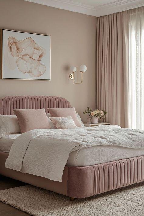
Muted blush beige is a soft neutral with a subtle pink or rosy undertone. It offers a gentle alternative to traditional beige and brings a little personality to a room without introducing a strong decorative color. The result is a warm, delicate shade that can feel sophisticated rather than overly sweet.
This color is particularly appealing in bedrooms, dressing rooms, and cozy reading corners. A blush-beige wall behind a cream upholstered bed creates a soft backdrop that feels inviting and calm. Combine it with ivory bedding, pale wood, and textured linen to keep the overall look natural.
In a living room, muted blush beige works well as an accent rather than a dominant shade. Consider using it in cushions, curtains, an upholstered chair, or artwork. When combined with warm taupe, caramel, and creamy white, it adds a subtle variation that makes a neutral palette feel more personal.
Muted blush beige also pairs nicely with natural materials. Oak, rattan, linen, and stone help ground the rosy undertone, preventing the color from looking too sugary or decorative. A few darker brown accessories can add contrast and make the palette feel more mature.
Decorating tip: Choose a dusty, understated blush with beige undertones rather than a bright pink. It will blend more easily with other warm neutrals and remain versatile as your decor changes.
14. Natural Linen
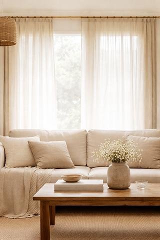
Natural linen is a soft, earthy neutral inspired by undyed linen fabric. It usually falls somewhere between beige, oatmeal, and pale taupe, with a slightly muted appearance that makes it feel relaxed and organic. It is a particularly useful shade for people who love simple interiors but don’t want their homes to feel stark or overly minimal.
One of the easiest ways to introduce natural linen is through curtains. Linen curtains in a warm beige tone filter light beautifully and create a soft transition between windows and walls. Pair them with creamy white walls, wooden furniture, and a textured rug for a comfortable, cohesive look.
Natural linen is also an excellent choice for sofas, bedding, and upholstered dining chairs. Its understated color allows texture to become the main feature. A linen sofa, for example, can look completely different depending on whether you style it with boucle cushions, a knitted throw, or smooth cotton pillows.
For walls, linen-inspired paint colors can provide a subtle alternative to traditional beige. They are especially effective in bedrooms and living rooms where you want the space to feel calm and natural. To keep the palette from looking too uniform, introduce different shades of wood and a few deeper taupe or brown accents.
Decorating tip: Let texture do the decorating. Linen, jute, wool, wood, and handmade ceramics bring enough variation to make a natural linen palette feel layered and complete.
15. Soft Olive-Neutral
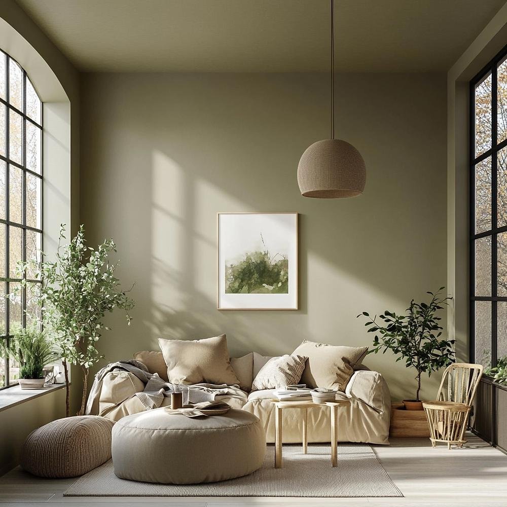
Soft olive-neutral is a muted green with warm, earthy undertones that allow it to blend naturally with beige, taupe, and brown. While green is technically a color rather than a traditional neutral, softer olive shades often behave like neutrals in interior design. They bring a connection to nature while remaining subtle enough to work with a broad range of furnishings.
If you want to add a little color to a warm neutral room without losing its calm atmosphere, soft olive is a useful option. Use it on a small accent wall, a pair of cushions, a painted cabinet, or an upholstered chair. Against cream and beige, muted olive creates a gentle contrast that feels grounded and natural.
In a bedroom, olive-neutral bedding can look beautiful with ivory sheets, warm taupe pillows, and wooden furniture. In a kitchen, muted olive cabinetry combined with cream walls and oak shelves can create an earthy, timeless appearance. The shade also works well in entryways, where it can introduce personality without overwhelming a transitional space.
Olive is particularly effective alongside natural materials. Stone, wood, linen, leather, and woven accessories reinforce its organic character. You can also use living plants to echo the green undertones and make the room feel connected to the outdoors.
Decorating tip: Keep olive muted and slightly earthy if you want it to function as part of a neutral palette. Pair it with warm ivory, sandy beige, and medium-toned wood for a balanced look.
How to Combine Warm Neutrals
Choosing beautiful neutral shades is only half the process. The real magic happens when you bring them together in a way that feels balanced, natural, and intentional. You don’t need to use every shade in this article, and you certainly don’t need to match every piece of furniture. A successful warm neutral interior usually relies on a small collection of related colors, with enough variation in depth and texture to keep the space interesting.
Start with a simple three-color palette
A practical way to build a warm neutral palette is to select three main colors: a light base, a medium supporting shade, and a darker accent. For example, you could use creamy white on the walls, sandy taupe on the furniture, and mocha brown in smaller decorative details. This creates a visual structure that makes the room feel coordinated without requiring everything to match.
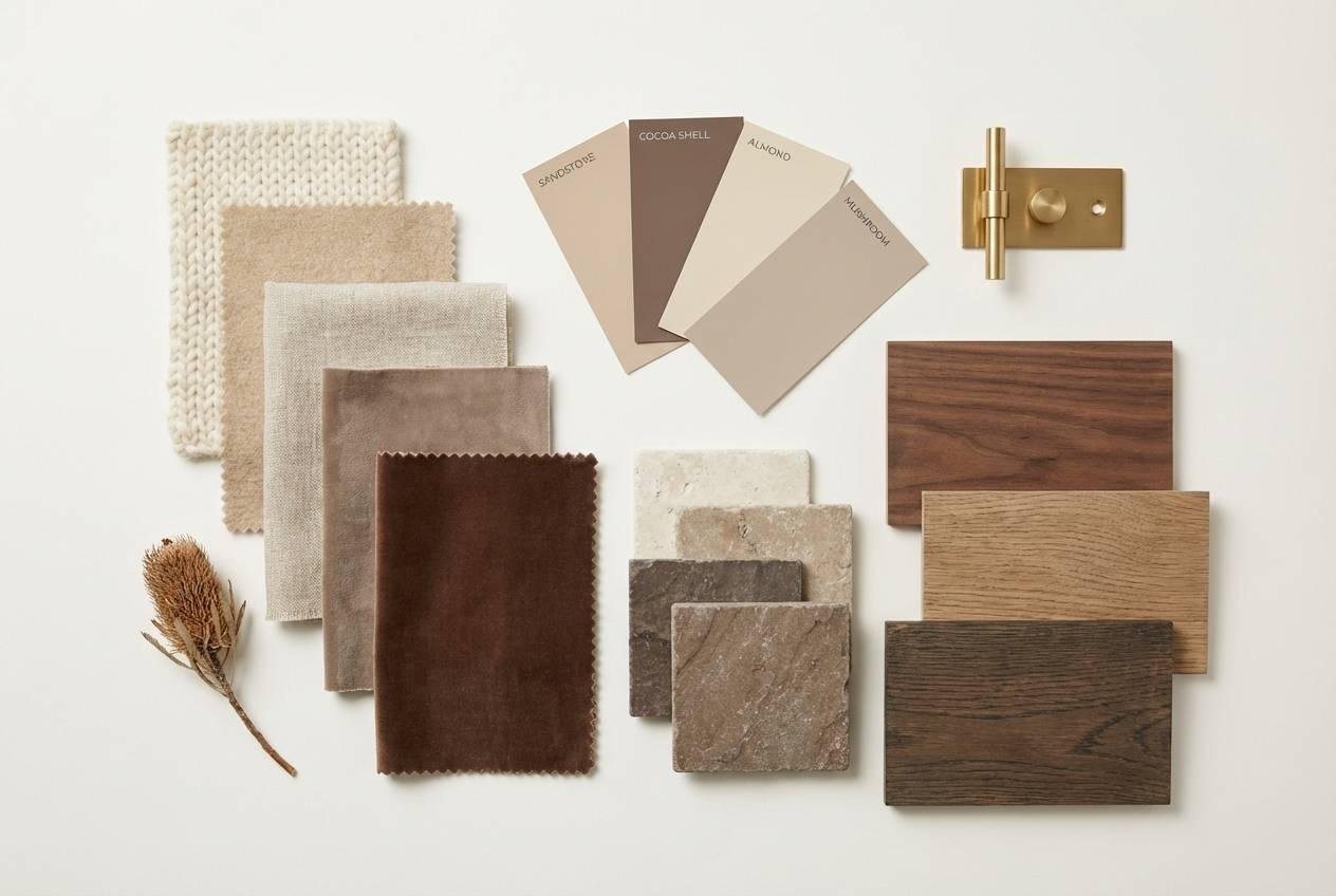
The lightest color usually covers the largest surfaces, such as walls, ceilings, or large curtains. Your medium shade can appear in sofas, rugs, bedding, or cabinetry. The darkest shade is useful for adding definition through picture frames, lamps, furniture legs, and decorative accessories.
You can also create a softer combination using warm ivory, oatmeal, and natural linen. This works particularly well in bedrooms and minimalist living rooms where you want a peaceful atmosphere. If the room starts to feel too pale, introduce a small amount of caramel or walnut to give it more depth.
Pay attention to undertones
Two neutral colors may look almost identical on their own but clash when placed next to each other. That’s usually because their undertones are different. A beige with a strong yellow undertone may look noticeably warmer beside a gray-based taupe, while a cool white can make a creamy wall color appear more yellow than expected.
Before purchasing paint or furniture, collect samples of the colors you plan to use. Place them next to your flooring, countertops, upholstery, and other permanent features. Look at them in natural daylight and under the lighting you normally use in the evening.
This step is especially important if you’re decorating an open-plan space. The same wall color may appear different in the kitchen, living room, and dining area because each space receives a different amount of natural light. Testing the palette throughout the connected rooms helps create a consistent appearance.
Use texture to add visual interest
A warm neutral room doesn’t need a lot of color to feel complete. Texture can provide the variation that bright colors might otherwise bring. Think about the difference between a smooth plaster wall, a chunky wool throw, a linen sofa, a wooden coffee table, and a woven basket. Even when these items share similar colors, their surfaces make the room feel layered.
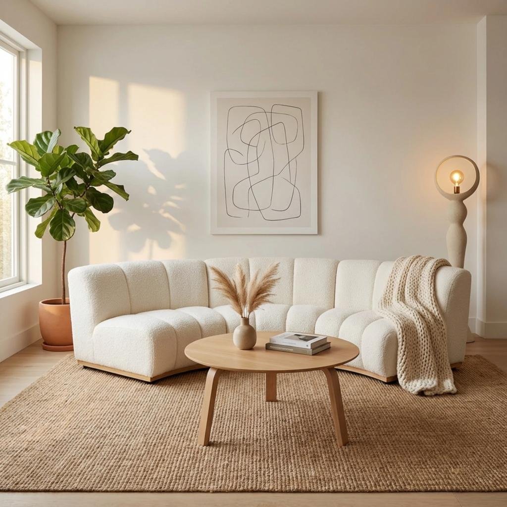
Try combining at least three different materials in a room. Natural wood, soft textiles, and stone or ceramic accessories make an easy starting point. In a bedroom, you could combine linen bedding, a textured wool rug, and a wooden bed frame. In a living room, boucle upholstery, a travertine-style coffee table, and woven window coverings can create a similar effect.
Texture also helps prevent a monochromatic room from looking like a showroom. Your home should feel comfortable enough to live in, not so perfectly coordinated that you’re afraid to sit on the sofa.
Balance light and dark shades
Warm neutrals look particularly attractive when they include a mixture of light and dark tones. If every surface is pale cream, the room may feel a little washed out. If every surface is dark brown or taupe, the room can feel heavier than you intended.
The solution is to distribute contrast throughout the space. A cream sofa can be balanced by a walnut coffee table, a darker rug pattern, or a few caramel cushions. In a bedroom with beige walls, deeper brown bedside tables and warm brass lighting can provide definition without disturbing the peaceful palette.
You don’t have to create dramatic contrasts. Even a small difference between ivory curtains and beige walls can make a room feel more dimensional. The goal is to give the eye a few places to rest while allowing the overall atmosphere to remain soft.
Tips for Decorating with Warm Neutral Colors
Warm neutral colors are easy to work with, but a few thoughtful decisions can make the difference between a room that feels beautifully layered and one that looks unfinished. The following ideas will help you apply these shades in a practical way, whether you’re decorating from scratch or simply refreshing your existing space.
1. Choose wall colors before buying large furniture
If you’re starting a room makeover, select your main wall color before committing to a large sofa, bed, or set of curtains. Walls cover a substantial area, so their undertones influence how the rest of the room looks. A beige sofa that appears warm in a showroom may look unexpectedly gray against a different wall color at home.
This doesn’t mean you have to choose paint before considering furniture altogether. Instead, collect inspiration and samples for both, then compare them together. If you already own a sofa or flooring that you plan to keep, use those pieces as the starting point for your palette.
2. Consider the direction of natural light
Natural light can change the appearance of neutral colors throughout the day. Rooms with limited or cooler daylight may make certain beige and gray shades appear more subdued, while strong sunlight can emphasize yellow or golden undertones.
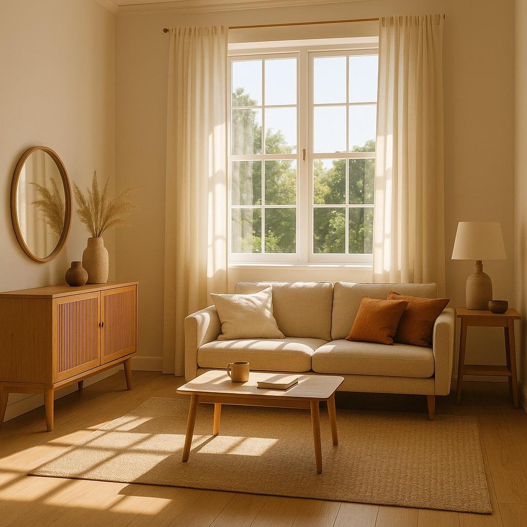
In a darker room, lighter shades such as warm ivory, creamy white, and pale oatmeal can help maintain a bright appearance. In a sunny room, you may have more flexibility to experiment with sandy taupe, mushroom brown, and deeper beige.
Always test paint samples on more than one wall. Observe them in the morning, afternoon, and evening before making your final decision.
3. Bring in natural wood
Wood is one of the easiest ways to make a warm neutral interior feel complete. Oak, walnut, ash, and other natural wood finishes introduce organic variation that works beautifully with cream, beige, taupe, and brown.
You don’t have to use the same wood finish throughout the room. A walnut coffee table can work alongside oak flooring and a lighter wooden side table, provided the finishes share a compatible warmth. Repeating a wood tone in a few places, such as a frame, shelf, or furniture leg, can help connect the different pieces.
4. Use lighting to enhance warmth
Lighting has a major influence on the atmosphere of a neutral room. A space with beautiful beige walls and natural fabrics can still feel uninviting if the lighting is harsh or overly cool.
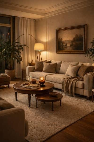
Instead of relying on a single overhead light, combine several sources. Floor lamps, table lamps, wall sconces, and pendant lights create layers of illumination that make the room feel more comfortable. Warm-white bulbs are often useful for cozy living spaces, although the exact color temperature should suit your preferences and the materials in the room.
Lampshades in ivory, linen, or warm beige can also soften the light and complement your color palette.
5. Add plants and natural accessories
A neutral color scheme doesn’t mean you have to avoid green. Houseplants, branches, and fresh flowers can bring life into a room while preserving its calm appearance. Soft olive and muted green tones work especially well with beige, ivory, and natural wood.
Choose accessories that contribute to the overall feeling rather than simply filling empty surfaces. A handmade ceramic vase, a woven basket, a stone tray, or a small stack of books can add personality without creating visual clutter.
6. Keep the palette consistent, not identical
One of the most common decorating mistakes is assuming that every neutral item must be the same shade. In reality, a room often looks more natural when the colors are related rather than identical.
For example, a cream sofa can sit comfortably beside oatmeal cushions, a sandy taupe rug, and a caramel accent chair. These shades are different, but their warm undertones connect them. This approach allows you to introduce new pieces over time without having to replace everything whenever your tastes change.
Conclusion
Warm neutral color ideas offer an easy way to create a home that feels welcoming, timeless, and full of personality. From creamy white and warm beige to mushroom brown, caramel, and muted olive, these shades provide countless opportunities to build a palette that reflects your own style.
The most successful warm neutral interiors aren’t necessarily the ones with the most expensive furniture or the most perfectly matched accessories. They’re the spaces where color, texture, lighting, and natural materials work together. A simple cream wall can look beautiful beside a wooden table, a linen curtain, and a well-loved sofa when each element contributes to the overall atmosphere.
Start with two or three shades that you genuinely enjoy, then introduce different textures and deeper accents to create balance. Test your colors in your own lighting, pay attention to undertones, and allow your home to develop gradually. Whether you prefer a bright ivory interior, an earthy beige living room, or a deeper palette with mocha and caramel, warm neutrals make it possible to create a space that feels comfortable today and remains adaptable for years to come.
Frequently Asked Questions
1. What are the most popular warm neutral colors for a home?
Some widely used warm neutrals include creamy white, warm beige, greige, sandy taupe, oatmeal, ivory, and mushroom brown. These colors work well in different decorating styles and can be combined with natural wood, stone, and textured fabrics. The right shade depends on the lighting, existing finishes, and atmosphere you want to create.
2. What is the difference between warm neutrals and cool neutrals?
Warm neutrals typically have yellow, red, orange, or brown undertones, giving them a softer and more inviting appearance. Cool neutrals tend to have blue, green, or cool gray undertones and can create a crisp, modern atmosphere. Comparing paint samples side by side is one of the easiest ways to identify the difference.
3. Which warm neutral colors make a small room look bigger?
Creamy white, warm ivory, pale beige, and light oatmeal can help a small room feel brighter and more open, particularly when they reflect available natural light. Using similar light shades on walls and larger furnishings can reduce visual interruptions. Mirrors, uncluttered surfaces, and layered lighting can also help the space feel more spacious.
4. Can warm neutral colors work with dark furniture?
Yes. Warm neutrals such as ivory, beige, oatmeal, and warm greige can balance dark walnut furniture, mocha brown accents, and darker leather upholstery. The contrast helps define the furniture while keeping the overall room comfortable. Adding warm lighting and soft textiles can make the combination feel even more inviting.
5. How can I decorate with warm neutrals without making my home look boring?
Focus on variation rather than adding lots of different colors. Combine light, medium, and dark neutral shades, and use materials such as linen, wood, wool, stone, and ceramics to introduce texture. A few carefully selected accents, including caramel, muted olive, or terracotta, can give the room personality while preserving its warm, neutral foundation.


Leave a Reply